We hope you enjoyed Part 1 of “Linen Rentals – Choosing Your Party Colors” and that the tips provided helped you pick your colors for your table settings. In this blog of Part 2, we will continue with more possible combinations of color to help you “wow” your guests.
Complimentary Colors:
For a much bolder look, choose the color that is directly across from your primary color. For example, turquoise is directly across from orange on the color wheel below.

So, for this table setting, we used our Amuse Orange linens and accented it with Turquoise napkins and our Turquoise Glass Charger to give the table some “pop”.
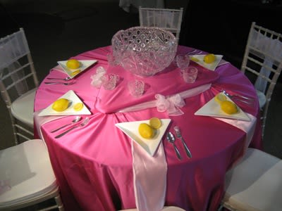
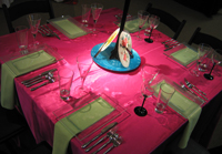
This Lamour Fuchsia table with Bengaline Apple Green napkins below, works because red and green are on opposite ends of the color wheel as well. By taking a lighter red (pink) and a lighter green (apple green), the 2 colors complement each other very well. But beware, if you use complimentary colors, the shade of the color needs to be similar as well. A dark green would not go well with a light red (pink) and vice versa.
Pairing with Neutrals:
Also, don’t forget to use your neutrals. These neutral colors pretty much match any color you choose. When talking about linens, these neutral colors are your browns, blacks, whites, and ivorys.
Introduce a lighter accent linen color paired with a neutral for something subtle, yet colorful. For example, Lamour Kiwi napkins paired with Lamour Chocolate linens.
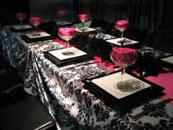
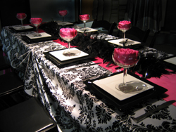
Choose a bright color for boldness and pair it with two neutral colors. For example, this Orleans Black and White linen is accented with Lamour Fuchsia napkins and a Lamour Fuchsia table runner down the middle.
You can use the Monochromatic rule mentioned in Part 1 (different shades of 1 color) above with your neutrals as well.
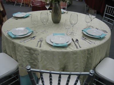
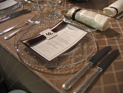
Here is a table setting with Trellis Pecan linens, Crushed Iridescent Ivory napkins and an ivory menu card with accents of chocolate on the menu and napkins.
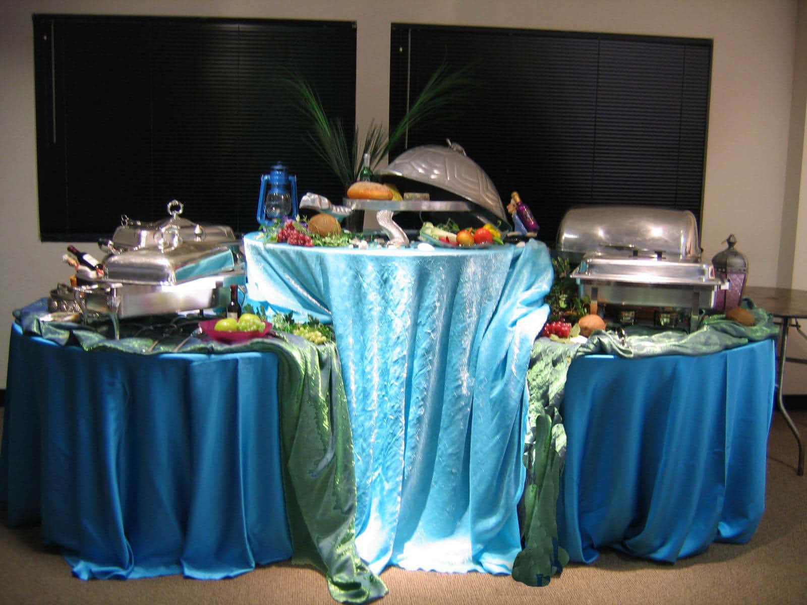
Other Accents
Lastly, besides your linens, don’t forget to use other components of your table setting to complete your look.
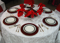
These Cherry Lacquer Chargers paired with Crushed Iridescent Valentine Red napkins really allow the red in this table setting to stand out.
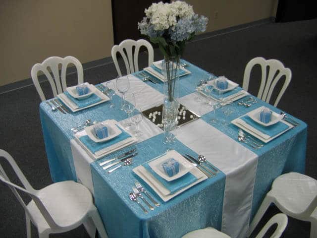
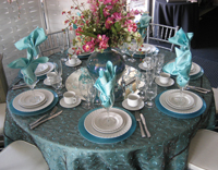
This monochromatic table setting uses Lamour Tiffany Blue Napkins and Linens with the Organza Chocolate with Tiffany Swirl overlay and Turquoise Glass Charger. The centerpiece flowers introduces the color pink as the accent color for this table.
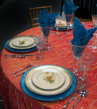
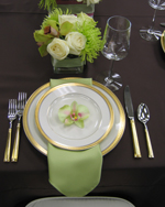
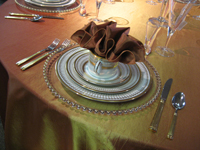
Use your china settings and flatware to complete your look. This table setting uses the Da Vinci China and Acropolis Gold flatware to match the Taffeta Sunrise linens and Bengaline Spice napkins harmoniously.
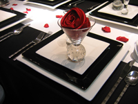
Use your glassware in many creative ways. Here, a Sphere Martini glass is used to hold a Lamour Scarlet napkin and is placed on the Picasso China as a central focal point on each individual place setting.
We hope these tips will help you put together your color scheme and table settings for your next event. As always, we would love to see what you have come up with. Please e-mail us your event pictures to [email protected] and they may be featured on our website or Facebook.
Or, if you need help in designing your own table settings, please let us know how we can help by contacting us.
Please leave us a comment. We’d love to hear from you.